Bringing more foodpanda Pick-up users
Role
Lead product designer
At
Delivery hero
With
Product manager, User researcher, Engineer
Overview
Summary
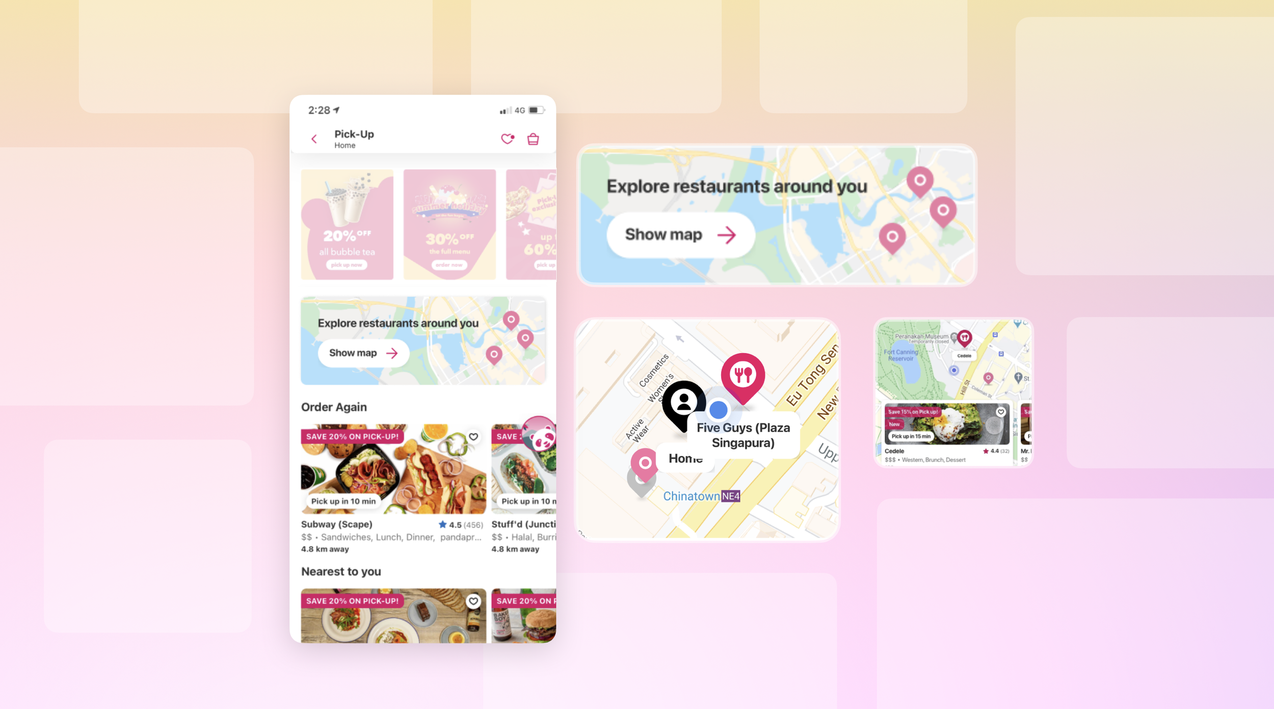
Pick-up (food takeaway) was 1 year-old product. However, it had only 1.5% customers of all orders which was critical. We took a step back and started with several moderated user research and data analysis. By optimizing the experience and modernizing the visual and content tone, we successfully brought 7% additional users to Pick-up.
Users
foodpanda users in APAC
Platform
iOS, Android, and Web
Key areas
User testing, Research, Prototyping
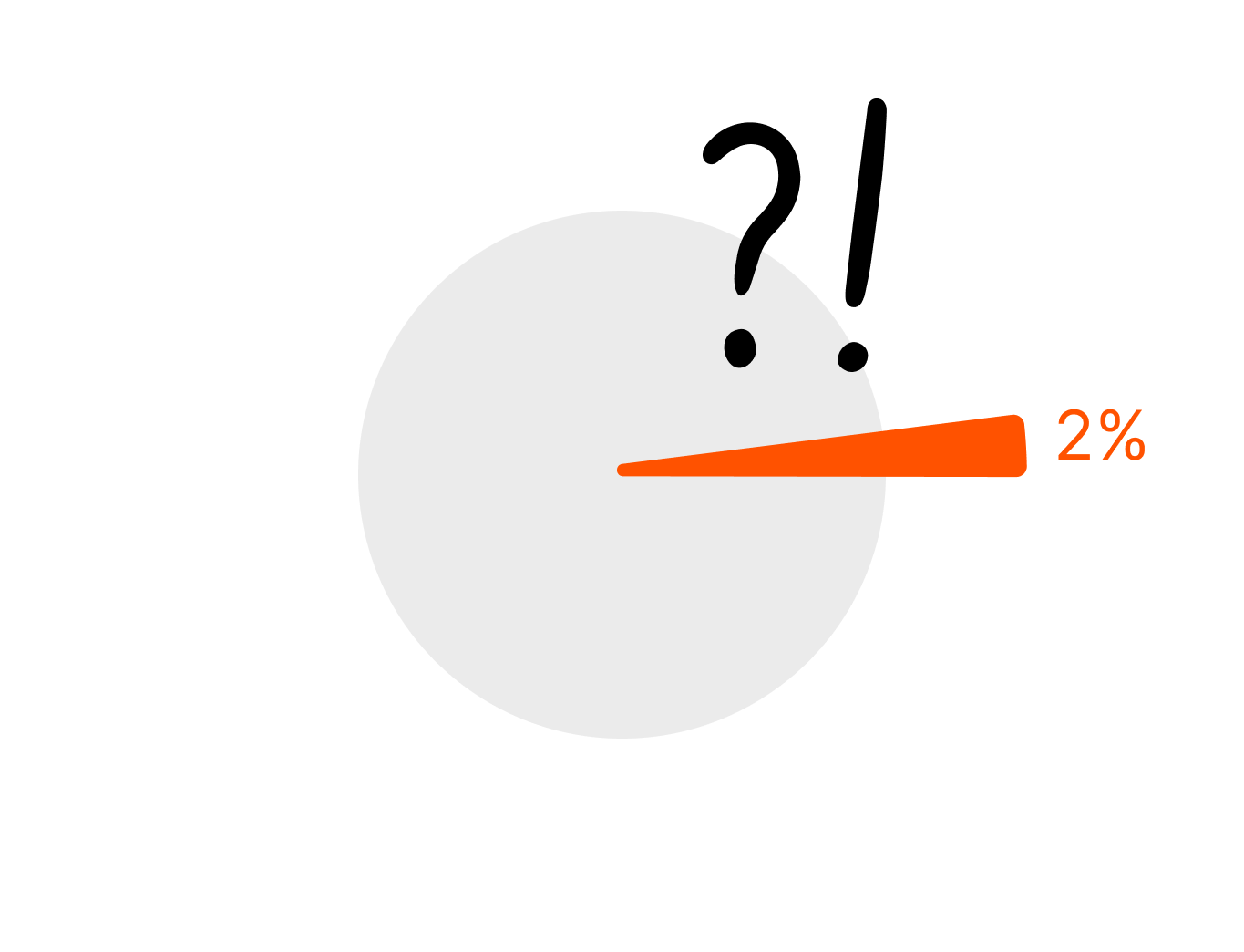
Why only 0.3% of the users used the map view? How come less than 2% of people used Pick-up?
Taking a step back
Starting from blank canvas
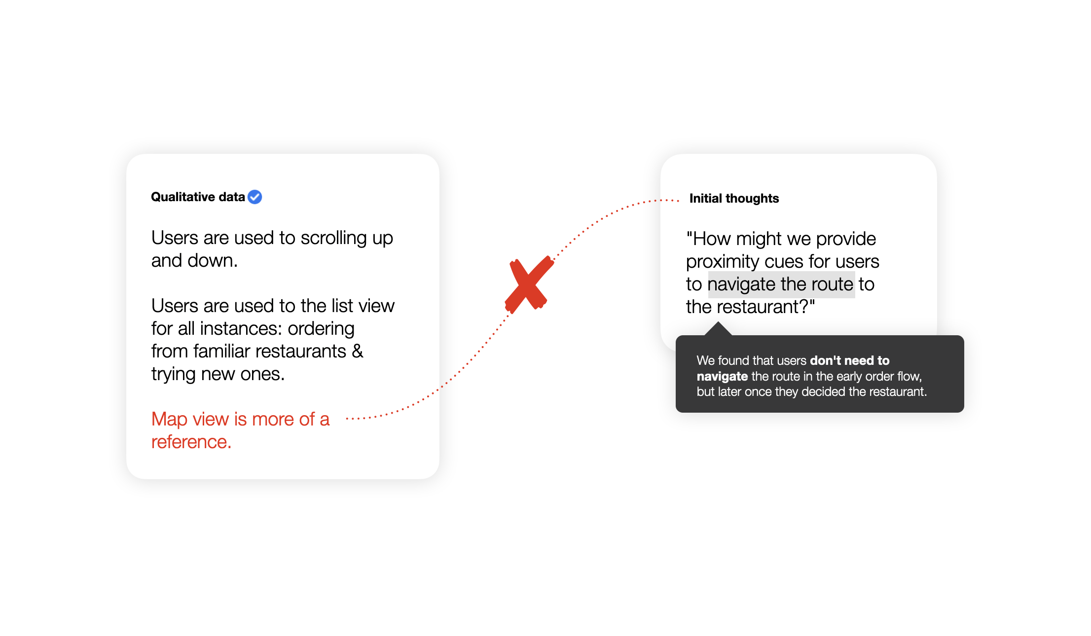
Finding disconnection
We also defined user’s preferred method and interaction when finding restaurants. This validated that user’s need doesn’t match to the initial hypothesis.

Questioning current design

Static visual
The map only had horizontal list of restaurants beneath the map. Also it didn’t auto-refresh the page so users had to hit ‘search this area’ every time they move the view.
Manual process
Users complained that there’s no meaningful information to find from this map view. So they ended up use other map apps to refer to the pictures, menu, and location.
Understanding users
Through moderated and unmoderated user researches, we defined user’s mental model to guide us: users motivations, end to end user flow outside of the app, and use cases.

Reframing questions with data
We listed qualitative and quantitative data to reframe the questions. This informed our design and interactions.
Reframed questions
🔍 How might we guide users on the map with the most necessary and valuable information?
⚖️ Users prefer to see the list view even when they are seeing a map. How might we bring the ‘list’ experience with the map?
✨ Currently the map view is static and displays minimum information. How might we utilize the map screen?
Solutions
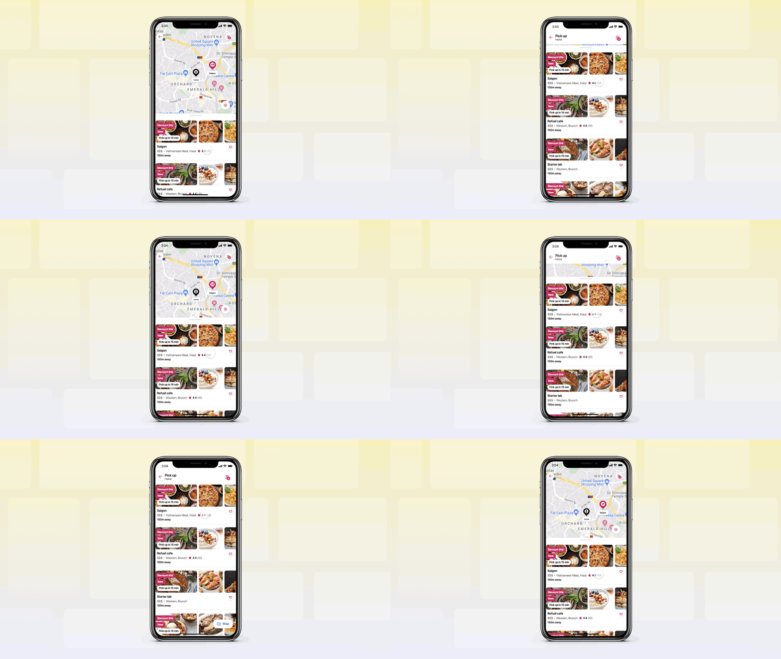

⚖️ How might we bring the ‘list’ experience with the map?
Seamlessly transmitting between map and list through vertically scroll. Allowing users to convert to the map view on a click.
🔍 How might we guide users on the map with the most necessary and valuable information?
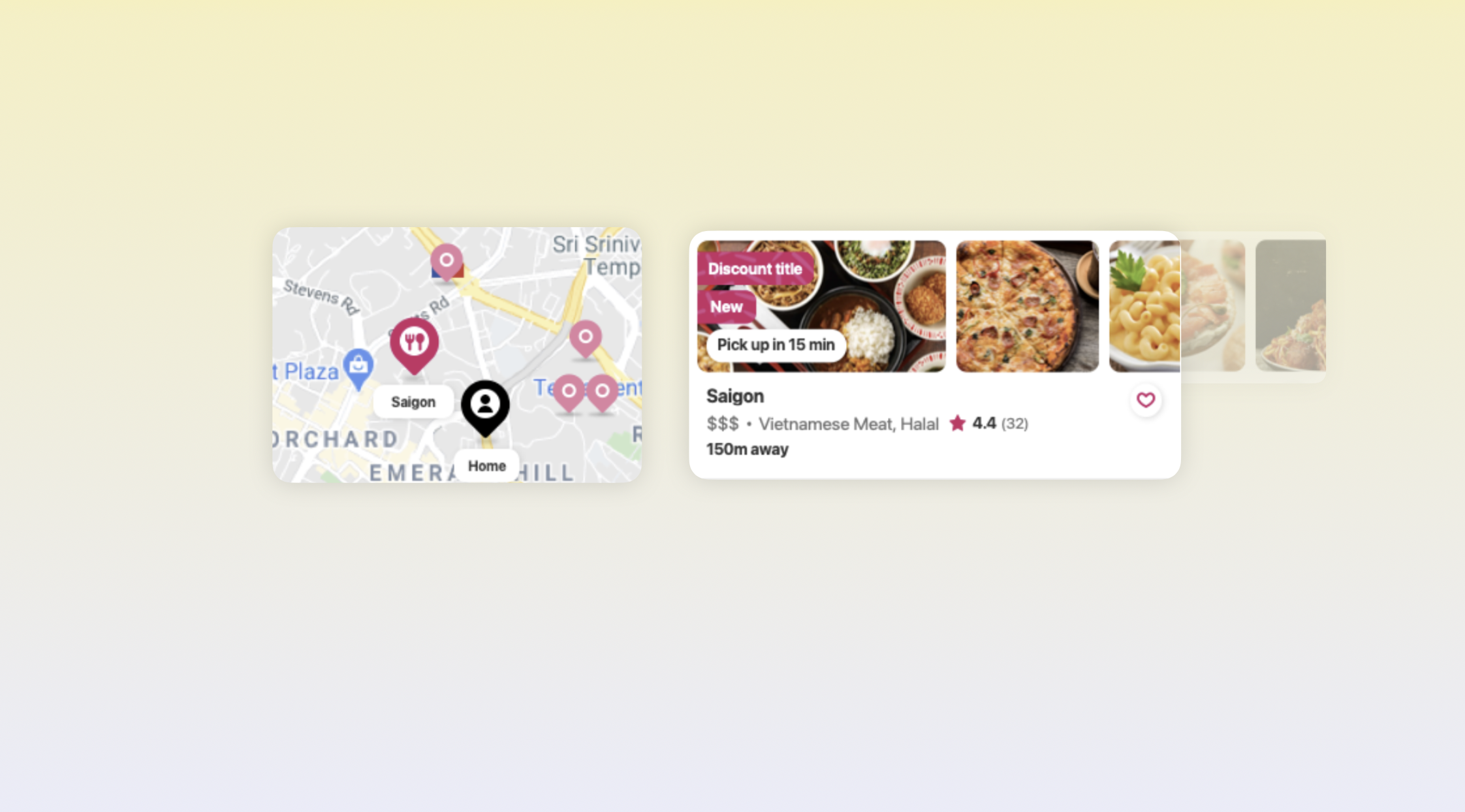
According to the research, users find the following information most valuable: My location, the restaurant locations, distance from me to the restaurants.
New design introduced a bigger pin for ‘My location’, and distance indicator ‘150m away’.


Elevating the look
Not only modernizing the icons but also improving usability like truncated text on the pin label.

✨ How might we utilize the map screen?
Having the map and list view on a stacked layer: users can easily refer to the restaurant location on a map, and find more information like distance, rating and pictures.
🔍 How might we guide users on the map with the most necessary and valuable information?
Users don’t need to know the closed restaurants. Better element hierarchy: Rearranging the element hierarchy to reduce clutter.

Fixing the tone
From ‘We found restaurants’ to ‘Explore restaurants’ — entire tone of the visual became encouraging. We replaced the busy background image to cleaner map, and made the banner taller.
New design had 5% more orders, resulting significant increase of pick-up users by 7%
Impact
Thank you!
Did I have your attention?
Read more about with me 💙